Ever notice how glued we are to our phones these days? It’s no surprise that more than half of global web traffic now comes from mobile devices. Whether people are browsing, shopping, or killing time on social media, they’re doing it on their smartphones. But here’s the kicker: despite this huge shift, a lot of businesses still don’t optimize their websites for mobile. And that’s where Mobile SEO steps in to save the day
So keep reading this blog, because we will be disclosing all secrets you need to optimize the your website for mobile friendly .
what is Mobile SEO
In simple terms, mobile SEO is about making sure your website looks and works great on mobile devices. It’s not just about making things fit on a smaller screen; it’s about creating a smooth, fast, and user-friendly experience for people browsing on the go. And since Google now ranks websites based on their mobile versions first, getting mobile SEO right is a huge deal.
Think about it: if your website is slow to load or hard to use on a phone, people won’t stick around. In fact, 53% of mobile users will leave a website that takes longer than three seconds to load. That’s a lot of potential customers slipping through the cracks! This is why mobile SEO isn’t just important – it’s essential if you want to stay competitive and keep your audience engaged.
Why Should You Care About Mobile SEO?
someone visits your site on their phone, but it takes forever to load. Frustrated, they click away and find a competitor whose website works perfectly. You just lost a customer. This happens all the time, and it’s one of the reasons why mobile SEO is so critical for businesses today. Your site’s performance on mobile can make or break your success online.
And, let’s face it: in the age of mobile-first indexing, where Google primarily looks at the mobile version of your site for ranking, if you’re not optimized for mobile, you’re falling behind.

Why Mobile SEO so important for google indexation ?
Over 60% of Google searches now come from mobile devices. That’s why Google introduced mobile-first indexing back in 2018, and it’s a game changer. Essentially, Google now looks at your website’s mobile version first when deciding where to rank it. So, if your mobile site isn’t optimized, your search rankings could suffer, even if your desktop version is flawless.

What Is Mobile-First Indexing, Anyway?
In the past, Google would mainly look at the desktop version of your site to figure out how to rank it in search results. But with mobile traffic skyrocketing, they shifted their approach. With mobile-first indexing, Google primarily uses your mobile site’s content, structure, and user experience to determine how high (or low) your site appears in search results.
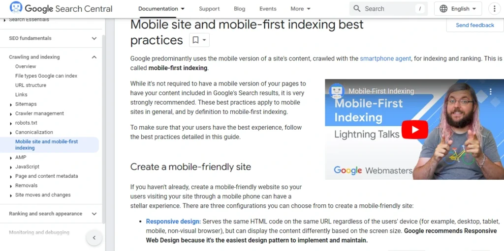
So, why is this such a big deal? It means that even if most of your visitors use desktop, your mobile site is now the priority. If it’s slow, hard to navigate, or missing key information, your rankings – and your traffic – could take a hit. And as we all know, lower rankings mean fewer eyes on your business
How Does Mobile SEO Impact Your Rankings?
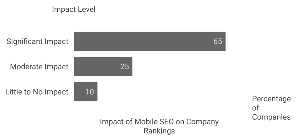
Think of Google like a teacher grading your site. If your mobile site doesn’t perform well, your “grade” (i.e., your ranking) will drop. This affects everything from
bounce rate to conversion rates – two key metrics that Google pays attention to. Here’s how mobile SEO plays into that:
- Page Speed: Slow-loading pages aren’t just annoying; they’re bad for SEO. Google has said outright that page speed is a ranking factor, especially on mobile. The faster your site loads, the better your chances of ranking higher.
- User Experience (UX): Google wants to serve its users the best possible results. That means your mobile site needs to be easy to navigate, with clear fonts, intuitive menus, and content that’s easy to read on smaller screens.
- Content Accessibility: If your mobile site hides certain content (like images, videos, or even text) that’s available on the desktop version, it could confuse Google’s crawlers. This might lead to missing or incorrect indexing of your site’s most important content.
Why Mobile SEO Equals Better User Engagement
Google’s ultimate goal is to give its users the best experience possible, and mobile SEO plays a huge part in that. When people have a smooth experience on your mobile site, they’re more likely to stay longer, click around, and even convert into customers. And guess what? Google notices this behavior. A site that keeps visitors engaged signals to Google that it’s a quality site worth ranking higher.

Here’s another key point: Mobile SEO is directly tied to local SEO. Many mobile searches have local intent – think about people searching for “coffee shop near me” while on their phone.
If your mobile site is optimized, you’re more likely to appear in local search results and get those valuable clicks from nearby users.
What is Google’s Mobile-First Index
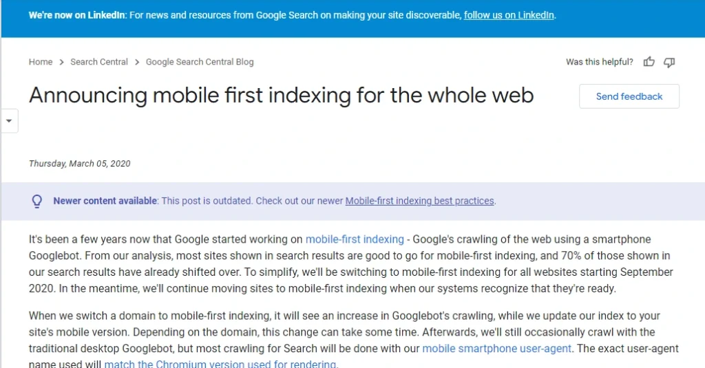
When Google introduced mobile-first indexing, it transformed the way websites are ranked. Mobile-first indexing means that Google primarily uses the mobile version of a website for ranking and indexing. So, instead of evaluating the desktop version of a site to determine its search engine rankings, Google now looks at how your site performs on mobile devices first.
Why Did Google Introduce Mobile-First Indexing?
The shift towards mobile-first indexing reflects how users interact with the web today. Research shows that 92.3% of internet users access the web via mobile devices at least some of the time. With this dominant trend, it became crucial for Google to adjust how it ranked websites. After all, the search engine’s goal is to deliver the best possible user experience, and mobile users are the majority.
Mobile SEO vs. Desktop SEO: Key Differences
| Mobile SEO | Desktop SEO | |
| – Mobile users are often on-the-go and seek quick, actionable information. – They prefer concise, scannable content and immediate solutions. – A significant portion of mobile users rely on voice search. – 58% of all searches come from mobile devices. | – Desktop users are more likely to perform in-depth research and comparison shopping. – They engage with longer content and often multitask while browsing. – Desktop search behavior tends to focus on more complex queries. – Desktop search sessions are usually longer than mobile. | |
| – Prioritizes responsive design that adjusts to different screen sizes. – Key features include thumb-friendly navigation, larger buttons, and minimal pop-ups. – Visual elements are simplified to ensure faster load times. | – Desktop websites typically feature more detailed navigation, larger images, and more content per page. – Full-screen designs and interactive elements are commonly used. – Pop-ups and sidebars can be more elaborate without negatively affecting usability. | |
| – Focuses heavily on mobile page speed, as slow-loading sites lose engagement. – Google recommends a 3-second maximum load time for mobile. – Mobile sites rely more on AMP (Accelerated Mobile Pages) for faster loading and streamlined content. | – Desktop performance often allows for more complex, media-rich experiences (larger images, videos). – Load times are important, but less critical than on mobile due to higher bandwidth and processing power. | |
| – Mobile SEO relies on mobile-first indexing, meaning Google predominantly uses the mobile version of a site to determine rankings. – Page experience metrics like Core Web Vitals are prioritized for mobile. – Optimizing for local SEO is crucial, as most local searches are mobile-driven. | – Desktop SEO continues to use traditional ranking factors like content relevance, backlinks, and on-page optimization, but mobile-first indexing still affects desktop rankings. – Core Web Vitals also impact rankings but are less critical for desktop compared to mobile. | |
| – Mobile SEO demands concise, scannable content. – Short paragraphs, bullet points, and optimized images work best. – Less space means prioritizing essential information and CTAs. | – Desktop allows for longer, more detailed content, including tables, infographics, and sidebars. – More space on desktop enables the use of multiple CTAs, detailed navigation, and related content. | |
| – Engagement is more fleeting on mobile, with users abandoning slow or confusing sites. – Calls to action (CTAs) need to be highly visible and easy to tap. – Mobile traffic often results in higher bounce rates if the site is not optimized. | – Desktop users are typically more engaged with content and may stay longer. – CTAs can be more subtle, and user interactions can be more complex (e.g., forms, comparisons). | |
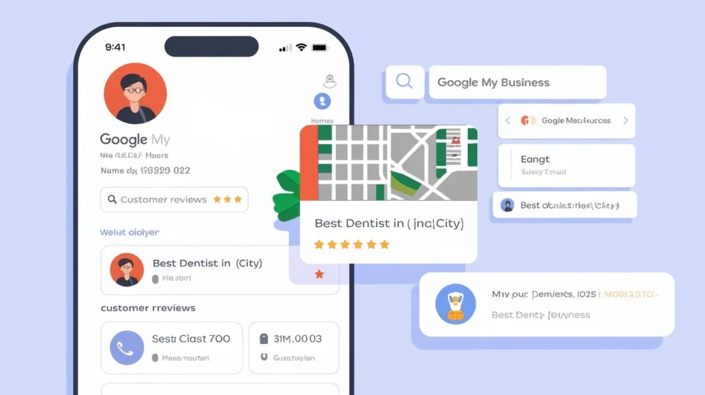
| – Mobile SEO plays a key role in local searches, with 76% of people who search for something nearby visiting a business within a day. – Google My Business and location-based keywords are essential. | – Desktop local SEO also matters but has less urgency compared to mobile searches. – Desktop local searchers are more likely to conduct research rather than make immediate decisions. | |
Aspect | Mobile SEO | Desktop SEO |
User Behavior | – Mobile users are often on-the-go and seek quick, actionable information.
– They prefer concise, scannable content and immediate solutions.
– A significant portion of mobile users rely on voice search.
– 58% of all searches come from mobile devices. | – Desktop users are more likely to perform in-depth research and comparison shopping.
– They engage with longer content and often multitask while browsing.
– Desktop search behavior tends to focus on more complex queries.
– Desktop search sessions are usually longer than mobile. |
Design | – Prioritizes responsive design that adjusts to different screen sizes.
– Key features include thumb-friendly navigation, larger buttons, and minimal pop-ups.
– Visual elements are simplified to ensure faster load times. | – Desktop websites typically feature more detailed navigation, larger images, and more content per page.
– Full-screen designs and interactive elements are commonly used.
– Pop-ups and sidebars can be more elaborate without negatively affecting usability. |
Performance | – Focuses heavily on mobile page speed, as slow-loading sites lose engagement.
– Google recommends a 3-second maximum load time for mobile.
– Mobile sites rely more on AMP (Accelerated Mobile Pages) for faster loading and streamlined content. | – Desktop performance often allows for more complex, media-rich experiences (larger images, videos).
– Load times are important, but less critical than on mobile due to higher bandwidth and processing power. |
Search Ranking Factors | – Mobile SEO relies on mobile-first indexing, meaning Google predominantly uses the mobile version of a site to determine rankings.
– Page experience metrics like Core Web Vitals are prioritized for mobile.
– Optimizing for local SEO is crucial, as most local searches are mobile-driven. | – Desktop SEO continues to use traditional ranking factors like content relevance, backlinks, and on-page optimization, but mobile-first indexing still affects desktop rankings.
– Core Web Vitals also impact rankings but are less critical for desktop compared to mobile. |
Content Layout | – Mobile SEO demands concise, scannable content.
– Short paragraphs, bullet points, and optimized images work best.
– Less space means prioritizing essential information and CTAs. | – Desktop allows for longer, more detailed content, including tables, infographics, and sidebars.
– More space on desktop enables the use of multiple CTAs, detailed navigation, and related content. |
User Engagement | – Engagement is more fleeting on mobile, with users abandoning slow or confusing sites.
– Calls to action (CTAs) need to be highly visible and easy to tap.
– Mobile traffic often results in higher bounce rates if the site is not optimized. | – Desktop users are typically more engaged with content and may stay longer.
– CTAs can be more subtle, and user interactions can be more complex (e.g., forms, comparisons). |
Local SEO | – Mobile SEO plays a key role in local searches, with 76% of people who search for something nearby visiting a business within a day.
– Google My Business and location-based keywords are essential. | – Desktop local SEO also matters but has less urgency compared to mobile searches.
– Desktop local searchers are more likely to conduct research rather than make immediate decisions. |
3 Core Methods to Optimize Your Website for Mobile SEO
optimizing your website for mobile SEO is crucial. Below, we’ll discuss three core methods to enhance your mobile website performance and improve rankings.
Method no.1 : Responsive Web Design (RWD)
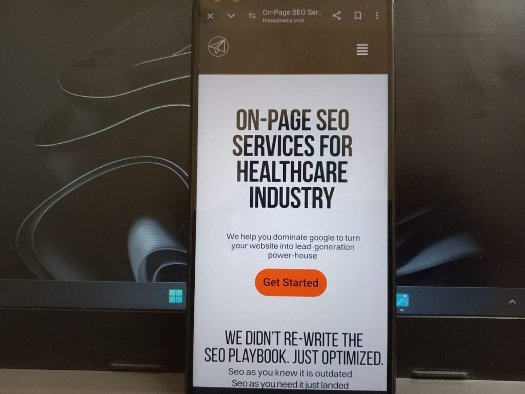
Responsive Web Design (RWD) is the cornerstone of mobile optimization. This design approach enables your website to adapt to various screen sizes—whether it’s a mobile phone, tablet, or desktop—offering a seamless user experience.
- RWD automatically adjusts layout, images, and content to fit different screen sizes using fluid grids, flexible images, and media queries.
- It ensures that users don’t need to zoom or scroll horizontally to view content, providing a smoother browsing experience.
94% of people cite poor design as the reason they mistrust or reject a website .
Benefits of Responsive web design for Mobile seo
- Improved User Experience: Since mobile users expect fast and easy navigation, RWD keeps them engaged by making your site easy to browse.
- Cost-Effective: Instead of creating multiple versions of your website for different devices, RWD allows you to maintain one website that functions across all devices.
- Google’s Preferred Option: Google highly recommends RWD for mobile SEO. Sites that use RWD generally perform better in search rankings because of the mobile-first indexing.
- Unified URL: Unlike separate URLs for mobile, RWD uses a single URL, which makes crawling and indexing by search engines easier.
Google found that 53% of mobile users leave a site that takes longer than 3 seconds to load, making fast-loading, responsive designs crucial for SEO success .
Method no.2 : Implementing Dynamic Serving for Effective Mobile SEO
Dynamic Serving is a method where the server detects the user’s device and serves different HTML and CSS depending on whether the user is on a desktop, tablet, or mobile device. While the URL remains the same, the content and design change to fit the device being used.
- When a user visits your website, the server identifies the user agent (i.e., the device type) and delivers content optimized for that specific device.
- This allows for customized mobile content, offering a more tailored user experience than RWD, which is generic to all devices.
According to Google, optimizing for mobile can improve your site’s chances of ranking well, as 85% of adults believe that a company’s mobile site should be as good or better than their desktop version .
Method no. 3 : Separate URLs for Mobile
Separate URLs, also known as m-dot URLs, involve creating a separate version of your website specifically for mobile users (e.g., m.yourwebsite.com). When users access your site via a mobile device, they are automatically redirected to the mobile version.
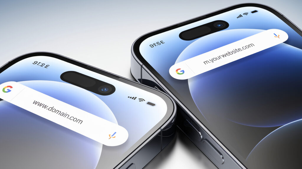
- Separate mobile URLs operate by identifying whether the user is on a mobile or desktop device, then redirecting them to the appropriate version of the site.
- For instance, a user visiting the desktop version of your website (www.example.com) on a mobile device would automatically be redirected to the mobile version (m.example.com).
Benefits:
- Device-Specific Optimization: Like dynamic serving, having separate URLs allows for mobile-specific design and content optimization.
- Easier Tracking: Separate URLs make it easier to track mobile traffic separately from desktop traffic, providing more granular insights into user behavior.
Challenges:
- SEO Complexity: Separate URLs can cause SEO issues if not managed correctly. For example, duplicate content could harm your rankings if the mobile and desktop versions are not properly tagged with rel=”canonical” and rel=”alternate” attributes.
- Increased Maintenance: Maintaining two separate versions of your website means double the effort in terms of content updates, technical maintenance, and testing.
Top 10 Essential Mobile SEO Best Practices
#1. Optimize Page Speed for Mobile
Page speed is a critical factor in both user experience and search engine rankings. Mobile users expect fast load times, and when your site lags, it not only affects their experience but also increases bounce rates.
Tips to Improve Mobile Page Speed:
- Minimize HTTP Requests: Reduce the number of files your website has to load, including images, scripts, and stylesheets. Tools like Google PageSpeed Insights can help identify unnecessary elements that slow your site down.
Google’s research shows that 53% of mobile visitors leave a site that takes longer than 3 seconds to load. By improving mobile speed, you can reduce bounce rates and increase engagement
- Enable Browser Caching: This allows previously visited pages to load faster by saving a version of the website to a user’s device. Enabling caching for mobile users helps in reducing load time when they revisit your site.
- Compress Images: High-resolution images can slow down your site’s speed significantly. Use image compression tools like TinyPNG or ImageOptim to reduce file size without compromising quality.
- Use Accelerated Mobile Pages (AMP): AMP is a Google-backed project designed to make pages load faster on mobile. It strips down your pages to their essential elements, ensuring faster loading times.
Pages that load within 2 seconds see a 15% higher conversion rate than slower pages, making speed optimization essential for mobile SEO and business growth.
- Leverage Content Delivery Networks (CDN): A CDN helps distribute content globally, allowing users to access your site from servers located closer to them, reducing latency and improving load time.
#2. Enhance Readability on Mobile
Designing content that’s easy to read and navigate on small screens is essential for mobile SEO. Mobile users typically skim through content, and if the layout isn’t optimized, they’re more likely to abandon the page.
How to Improve Readability:
- Use a Mobile-Friendly Font Size: Google recommends using a base font size of at least 16px for mobile devices. Anything smaller can force users to zoom in, creating a frustrating experience.
- Short Paragraphs and Clear Headings: Break content into bite-sized paragraphs and use clear headings (H2, H3, etc.) to help users navigate the page easily. This structure is especially helpful for mobile users who skim content.
- Clickable Elements Should Be Easy to Tap: Buttons and links should be large enough for mobile users to tap easily. Google advises a tap target size of at least 48px by 48px, making it easier for users to interact with your site.
- Whitespace for Clarity: Whitespace (the empty space around elements) helps improve readability by reducing clutter. It guides the user’s attention to important elements and makes text easier to follow on a small screen.
- Prioritize Above-the-Fold Content: Ensure the most crucial information is visible without the need to scroll. On mobile, users want quick access to what they need, and long scrolling can deter engagement.
The average mobile user reads 30% slower on small screens than on desktop, making it essential to present content in an easily digestible format .
#3. Ensure Access to All CSS, JavaScript, and Image Files
Blocking access to important resources like CSS, JavaScript, and images can have a detrimental effect on your mobile SEO. Google’s mobile-first indexing relies on these files to render and understand your website properly.
Why You Shouldn’t Block Resources:
- Google Needs to Render the Full Page: When you block CSS, JavaScript, or image files, Google’s crawlers cannot fully render your page. This can lead to improper indexing and lower rankings.
- Critical for User Experience: CSS controls how your site looks, while JavaScript manages dynamic elements. Blocking these files can result in a broken user experience on mobile devices, as users won’t see the website as intended.
- Responsive Design Relies on CSS and JavaScript: If you’re using responsive web design (RWD), blocking CSS or JavaScript can prevent the mobile version of your site from rendering correctly. Google needs access to these files to recognize that your site is optimized for mobile.
- Image Optimization: Don’t block image files, as optimized images contribute to faster load times and better mobile performance. If Google can’t access images, your site’s perceived value can drop, affecting your rankings.
Google’s Webmaster Guidelines state that blocking resources like CSS, JavaScript, and images can hurt your rankings by affecting how Googlebot renders and indexes your content.
#4. Avoid Unplayable Content and Fix Faulty Redirects.
Unplayable content, such as videos or other media that can’t be accessed on mobile devices, can frustrate users and negatively affect your mobile SEO. Similarly, faulty redirects can lead users to unintended pages or errors, disrupting their experience.
How to Avoid Unplayable Content:
- Choose Mobile-Friendly Formats: Ensure that any videos or media on your website are playable on all mobile devices. Avoid formats like Flash, which many mobile devices no longer support. Instead, use widely supported formats like HTML5 for videos and other media.
- Test Media Across Devices: Before deploying media content, test it across various mobile devices and browsers to ensure compatibility. This helps prevent playback issues that could turn users away.
- Use Proper Embedding Practices: Ensure that videos are embedded using responsive video players. This way, the player adjusts to the screen size, ensuring a seamless experience for mobile users.
Fixing Faulty Redirects:
- Avoid Redirect Loops: Redirect loops happen when a user is redirected from a mobile page back to the desktop version or to another page that loops back. Make sure your redirects are set up correctly to avoid looping.
- Test Redirects for Mobile: Use tools like Google Search Console or Screaming Frog to test for faulty redirects on mobile. These tools will flag any broken redirects or pages that lead to errors.
- Set Up Device-Specific Redirects: If you’re using dynamic serving, ensure that mobile users are redirected to the correct mobile version of the page. Faulty redirects that lead to irrelevant or desktop versions can hurt your mobile user experience.
#5. Prevent Mobile-Only 404 Errors
One of the common issues in mobile SEO is pages that work perfectly fine on desktop but return 404 errors when accessed on mobile devices. These errors not only frustrate users but also send negative signals to search engines.
Tips to Avoid Mobile-Only 404 Errors:
- Ensure Consistent URL Structures: Make sure that the same URL serves content on both mobile and desktop versions of your site. If you use dynamic serving or separate mobile URLs, check that the mobile URL doesn’t result in a 404 error.
- Use Google Search Console to Monitor Errors: Google Search Console can help you monitor mobile-specific 404 errors. Regularly check the ‘Mobile Usability’ report to catch and resolve any errors before they impact your SEO.
- Redirect Mobile-Only Pages Correctly: If a page is unavailable on mobile, ensure there’s a proper 301 redirect set up to a relevant mobile-friendly page rather than leading users to a dead end.
- Check Internal Links: Sometimes internal links work on desktop but break on mobile. Ensure that internal linking is consistent across both versions to avoid mobile-only 404 errors.
- 68% of mobile users will leave a site if they encounter a 404 error on their first visit, underlining the importance of fixing mobile-only issues to retain traffic.
- Google’s Mobile Usability report shows that sites with fewer mobile errors are likely to rank 30% higher in mobile search results.
#6. Use ‘Rel=Alternate Media’ for Mobile Versions
- The rel=alternate media tag is an essential tool for websites that use separate URLs for mobile versions. This tag tells search engines that there’s an alternate version of the content optimized for mobile, helping with proper indexing and avoiding duplicate content issues.
How to Use Rel=Alternate Media Correctly:
Add the Tag to Desktop Pages: If your website has separate mobile and desktop versions, add the rel=alternate tag to the desktop version, pointing to the mobile URL. This signals to Google that the mobile version is the appropriate page for mobile users.
Example:
html
<link rel=”alternate” media=”only screen and (max-width: 640px)” href=”https://m.example.com”>
Use Canonical Tags for Mobile Pages: In addition to the rel=alternate tag, use canonical tags on mobile versions to point back to the desktop version. This ensures that Google treats both URLs as the same content, preventing duplicate content penalties.
Example:
html
<link rel=”canonical” href=”https://www.example.com”>
Testing Rel=Alternate Setup: You can test whether your rel=alternate tags are correctly set up using Google’s Mobile-Friendly Test Tool or by checking the ‘Inspect URL’ feature in Google Search Console.
Benefits of Using Rel=Alternate Media:
- Improved Mobile SEO: Ensuring that mobile pages are indexed correctly boosts your search engine rankings for mobile queries.
- Avoids Duplicate Content Issues: Using rel=alternate with canonical tags prevents Google from mistakenly treating your mobile and desktop versions as duplicate content.
- Enhanced User Experience: When set up properly, the rel=alternate tag helps ensure users always land on the version of the site best suited to their device.
According to Google, websites that correctly implement the rel=alternate media tag see up to 15% better mobile rankings due to improved indexing.
Duplicate content issues can cause up to a 50% drop in search engine rankings, highlighting the importance of using the rel=alternate tag in mobile SEO.
#7. Apply the "Vary: User-Agent" HTTP Header
The “Vary: User-Agent” HTTP header helps ensure that your server correctly distinguishes between requests from mobile and desktop devices. This header tells search engines to serve different content depending on whether the user is on a mobile device or a desktop computer, which is crucial if you’re using dynamic serving.
For Apache Server
If you’re using an Apache server, you can add the following lines to your .htaccess file:
<IfModule mod_headers.c>
Header append Vary User-Agent
</IfModule>
For Nginx Server
If you’re using Nginx, you can include the following line in your server block configuration:
add_header Vary User-Agent;
For Node.js (Express)
If you’re using Node.js with Express, you can set the header in your route handler like this:
javascript
app.get(‘/your-route’, (req, res) => {
res.set(‘Vary’, ‘User-Agent’);
// Serve different content based on user agent
if (/mobile/i.test(req.headers[‘user-agent’])) {
// Serve mobile content
} else {
// Serve desktop content
}
});
Why It’s Important:
Improves Mobile SEO: When using dynamic serving, Google needs to know whether the content changes based on the device type. The “Vary: User-Agent” header ensures that Google recognizes and correctly indexes both the mobile and desktop versions of your content.
Avoids Indexing Issues: Without this header, search engines may not realize there’s different content for mobile and desktop, leading to indexing issues or incorrect content being served to mobile users.
How to Implement:
You can add the “Vary: User-Agent” header through your server’s configuration, such as in Apache or Nginx. It ensures that content dynamically served based on device types is accurately processed.
#8. Use ‘Rel-Canonical’ Tags
Using rel=canonical tags helps avoid duplicate content between mobile and desktop versions of your website. When you have separate URLs for mobile, a canonical tag on the mobile version points to the desktop version, signaling to Google that both pages represent the same content.
Best Practices:
Add Canonical Tags to Mobile Pages: Ensure that every mobile page includes a canonical tag pointing to the corresponding desktop URL. This tells search engines to consolidate ranking signals to the desktop version, avoiding duplicate content penalties.
Example:
html
<link rel=”canonical” href=”https://www.example.com”>
- Helps SEO: Properly implemented rel-canonical tags prevent Google from splitting ranking signals between mobile and desktop versions, improving your site’s SEO health and performance.
#9. Optimize Titles and Meta Descriptions for Mobile Search
Optimizing your titles and meta descriptions for mobile is essential because search results on mobile devices often display fewer characters than on desktop. This makes it crucial to craft concise and impactful metadata that grabs attention in mobile search results.

Best Practices:
- Shorter Titles: Keep mobile titles between 50-60 characters to avoid truncation. Focus on making the title as informative and engaging as possible within this limited space.
- Compelling Meta Descriptions: Write meta descriptions of around 120-150 characters for mobile search. These descriptions should be concise, clear, and include a strong call to action to encourage clicks.
Why It Matters:
- Higher Click-Through Rates: Optimized metadata improves click-through rates (CTR) on mobile, which can boost your rankings and overall visibility in mobile search.
- Better User Experience: Short, informative titles and descriptions improve the user experience by clearly conveying what your page is about, even on small screens.
#10. Implement Structured Data for Mobile
Structured data helps search engines understand your content better and can enhance how your pages appear in mobile search results through rich snippets like ratings, reviews, and event details.
- Boosts visibility: Implementing structured data can result in rich snippets, such as star ratings or product prices, making your mobile search results stand out.
- Improves mobile SEO: Search engines can better interpret your content, improving its chances of being ranked higher in mobile search results.
- Tip: Use schema.org markup, which supports different content types like articles, products, and local businesses.
Conclusion
Mobile SEO isn’t just an option anymore – it’s a necessity. With more people browsing on their phones than ever before, businesses must ensure their sites are mobile-friendly to stay competitive.
From improving site speed to using responsive design, and optimizing for mobile search engines, these strategies make a big difference in user experience and rankings. The better your mobile site performs, the more traffic and conversions you’re likely to see.
By regularly tracking your progress and making small adjustments, you’ll ensure your website is always optimized for mobile users. Keep your site mobile-ready, and you’ll be ready for the future of SEO!
